Macys: Internal Branding
Employee Engagement Recognition
Recognition for Cross-Functional Teams
Macy's had 130,000 employees in 2017 and continues to
earn an annual revenue of over $20 billion annually, even with many market challenges. It made $25.7 billion in 2022. source Employees work seemlessly with others across timezones and regional offices daily, with many
corporate offices across the country. It is a brand first established in 1858 and a bonafide part of Americana. As a brand, it readily engages
and recognizes key members of the community.
I was the visual designer/ux writer brought in as part of a lean outreach team to create an internal recognition program. The program was piloted in 2014 and continues today. It was the Group Vice President of Engineering, Shared Services who spearheaded the committee and worked with Human Resources to ensure corporate adoption.
The Challenge
Create successful employee
recognition collateral and internal campaign that adds value to a person's day.
Must remain on-brand.
- Deliver unique, relevant graphic content users can physically deliver to team members for display recognition and gratitude for their everyday efforts and amazing feats under pressure
- Create user engagement and loyalty through personalized physical interactions and the opportunity to be recognized for outstanding work
- Allow users to easily, and in a fun way, put together compliments and details that can be used for team engagement and performance reviews
- Provide Macy's management with direct data focused on the traits and efforts of individual contributors often dismissed or forgotten in large projects with multiple teams spanning the globe
- Drive engagement and morale within Macys.com via recognition on proudly on display
- Make the hours at Macy's thought of as fun, engaging and innovative work
The Solution
I wanted to work with the roots of the company - shopping - with an understanding to the complexity it takes to be available 24/7 to ensure the site is always fully operational and all systems are green. The backstory of Macy's goes beyond the last century and some of its core fundamentals established then still survive today. Marketing, design, technical and logistical challenges can very much be rooted to this legacy. I wanted to show this is acknowledged and appreciated.
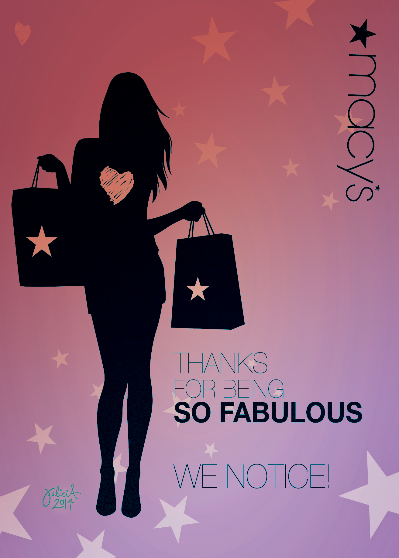
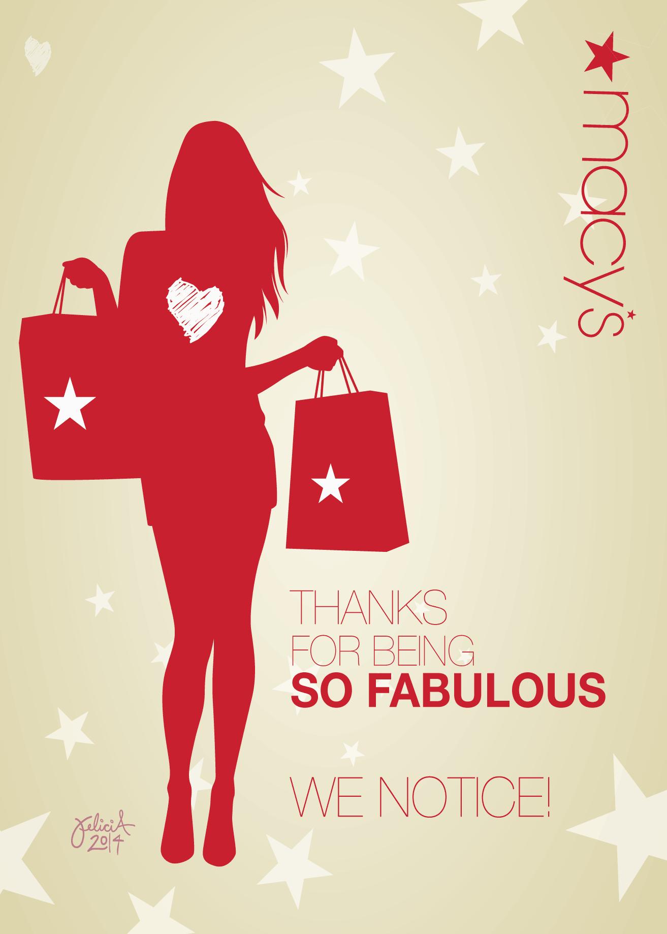
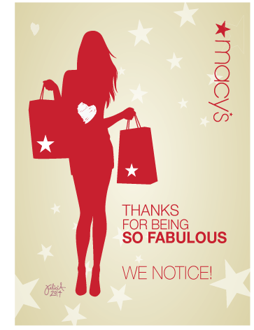
I drew a silhouette of a shopping woman, proudly holding her
logo bags and wrote the copy:
Thanks
for being so fabulous! we notice!
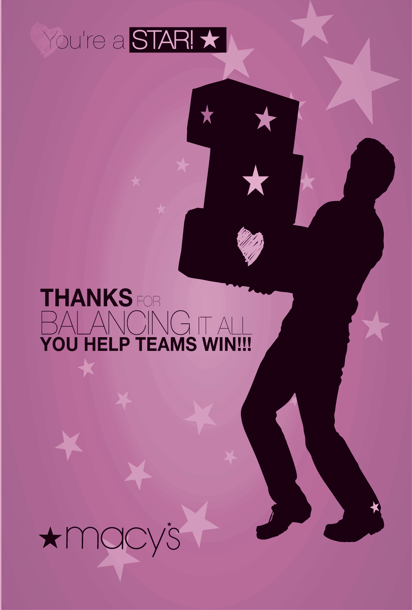
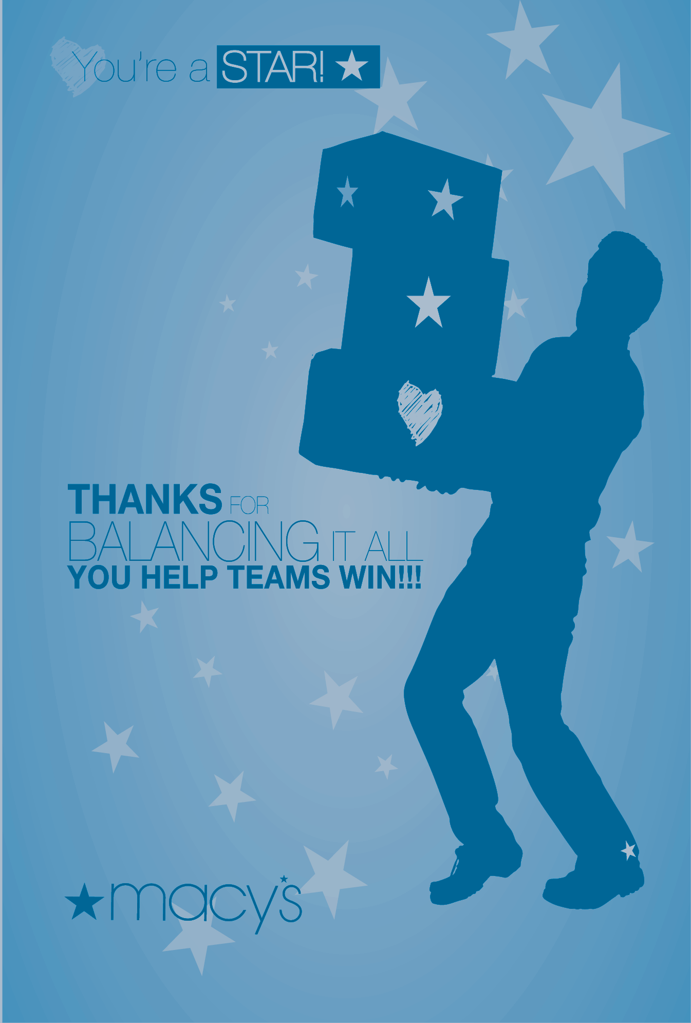
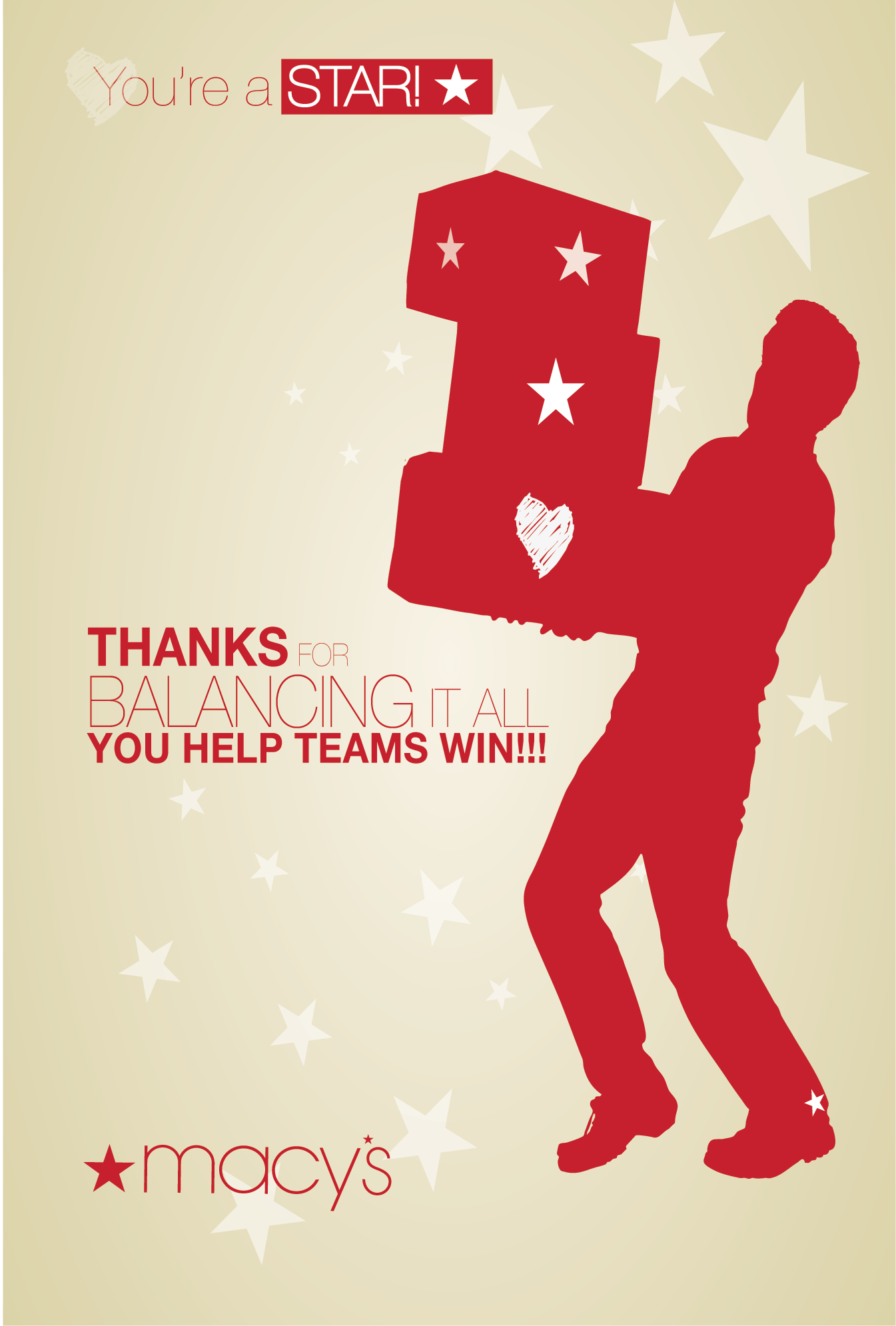
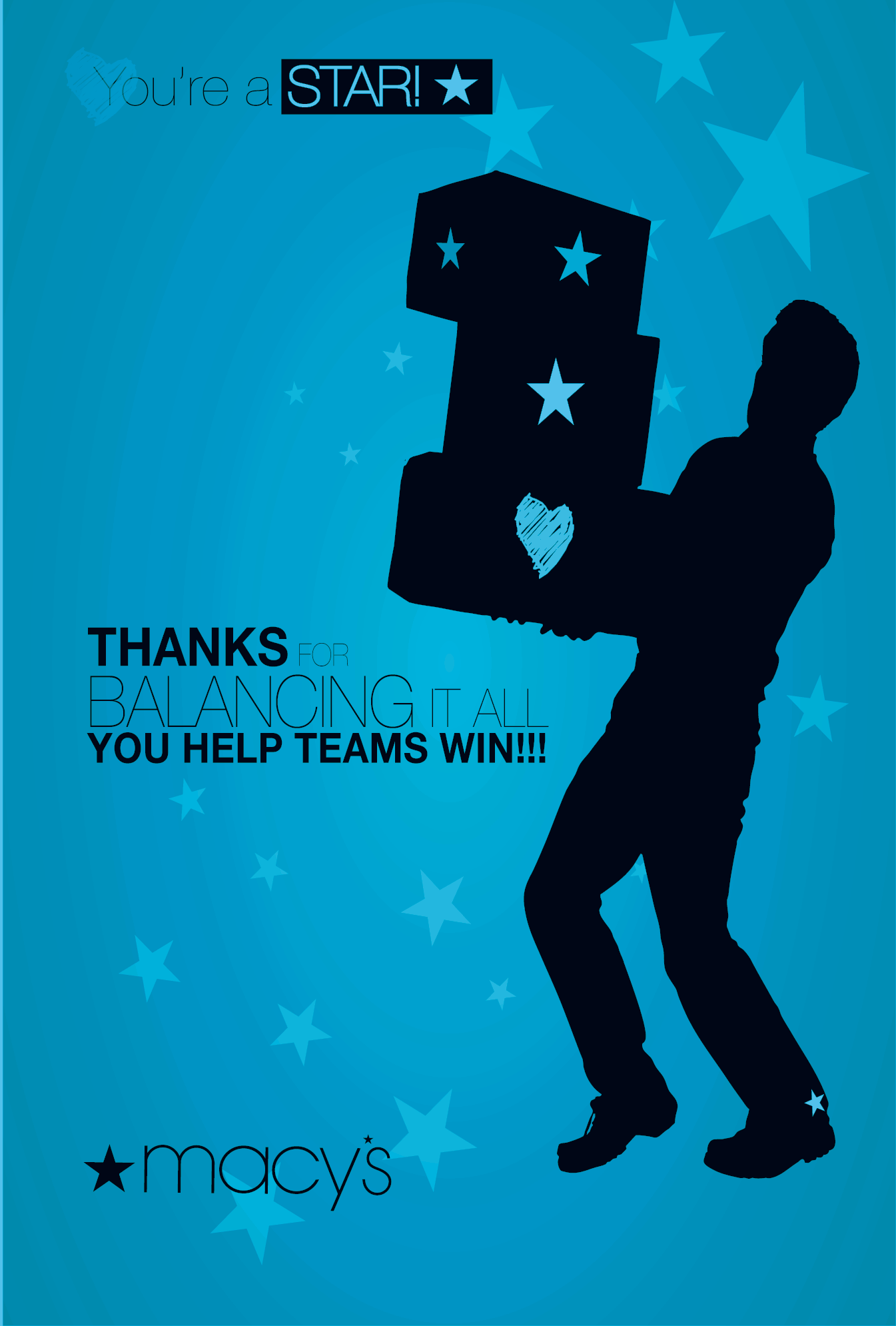
For a different option, I created a silhouette of a person juggling three stacked packages, two with the macy's logo,
one with a hand-drawn heart. I wrote the copy to say:
Thanks for balancing it all! You help teams
win!
With the idea of the visual metaphor being spot-on for a large variety of employees from project managers and software
developers to merchant managers and designers, the design and copy was quickly embraced and proudly displayed.
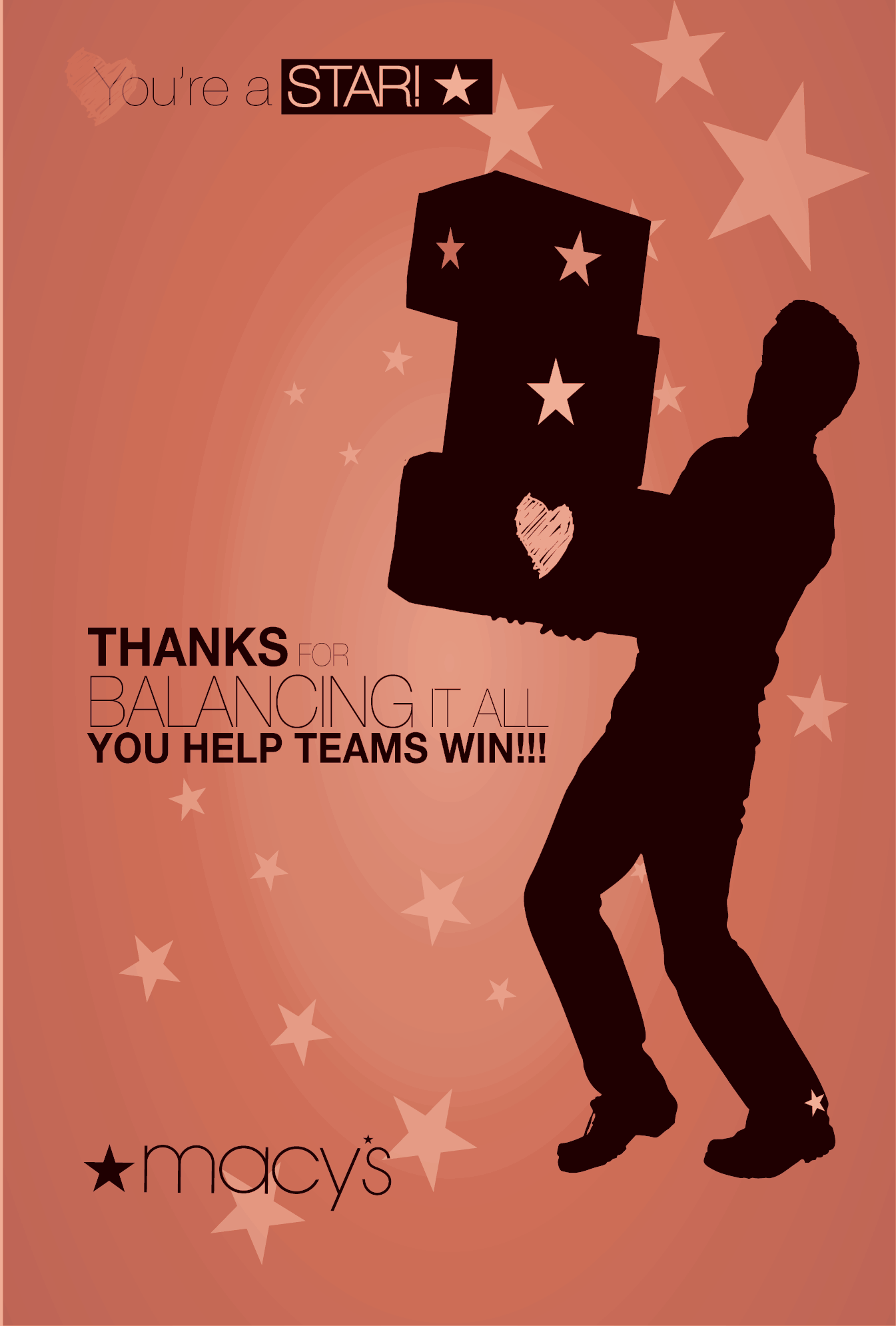
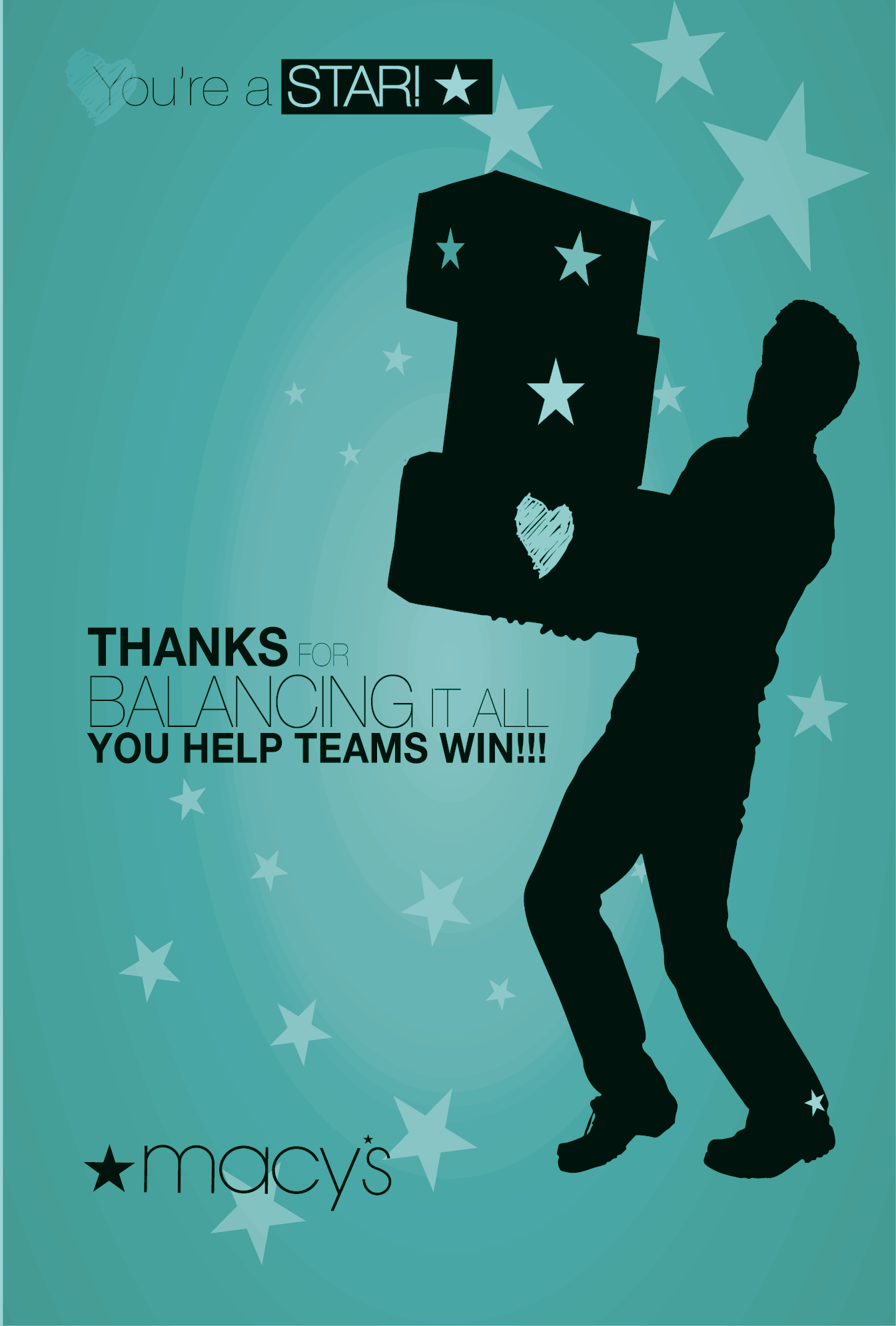
Macy's Corporate font for all communication was Helvetica Neue Ultra Light for internal marketing. It worked fine when printed, but not online. This became a key bargaining point within the organization. The initial printed run and designs had the ultra thin font, but later editions of the card were updated with a thicker version of the same font. In the beginning, only the red cards were produced and distributed. Later runs included multiple color selections. Users could download and print PDFs of their prefered design too. The color and design stood out as pround receipients hung the cards by their monitors. Cards all come with ample space to write appreciations.
Results
Employee engagement went up by 85% and the office seemed a bit more cheerful, colorful. The true metric measured was qualified in individual employee's annual reviews where they could show the cards' written comments to help boost their performance reviews and annual bonus. The end product was more than just a physical card: when an employee gifted the card, an electronic receipt was delivered to corporate human resources engagement database, the employees' supervisors, and the employees (giver, receiver). This data was measured, tracked, and quantified which ensured the program's continued success.
Visual Design & User Experience