I'm open to new opportunities.
If you're looking to connect, let's grab a coffee and chat!
Here's some of what I'm listening to →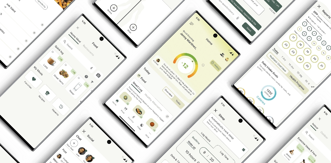
Transforming Diabetes Prevention through the Power of the Nudge
Nutu is an app guiding sustainable wellness through gradual and achievable steps based on real medical science.
Nutu is a digital health platform designed to prevent Type 2 diabetes and promote healthy living. Unlike traditional apps that focus on restrictive dieting, Nutu uses an evidence-based Green Zone approach to build sustainable habits.
While doctors often advise lifestyle changes to combat prediabetes, they don’t always have the time or resources to provide adequate guidance, and fad diets and influencers aren’t always informed by proven nutritional science.
The app is empowered by an AI guide who is always there to help. For those under medical care, especially those with diabetes or pre-diabetes, there is an optional ability to direct data to securely communicate to medical teams under CDC guidelines.
Subscribers get access to the personalized health and lifestyle platform created by Willow Laboratories.
Nutu is an app guiding sustainable wellness through gradual and achievable steps based on real medical science.
I worked to advocate a calm look and feel and to hide the complexity with a UI and UX that reduces anxiety and is engaging enough to want to use daily and honestly.
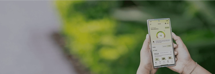
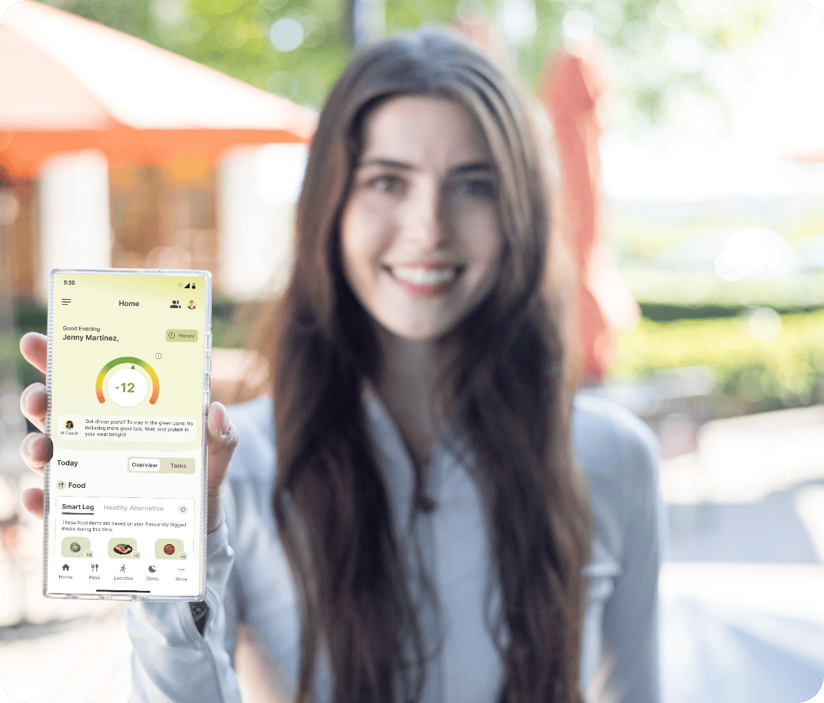
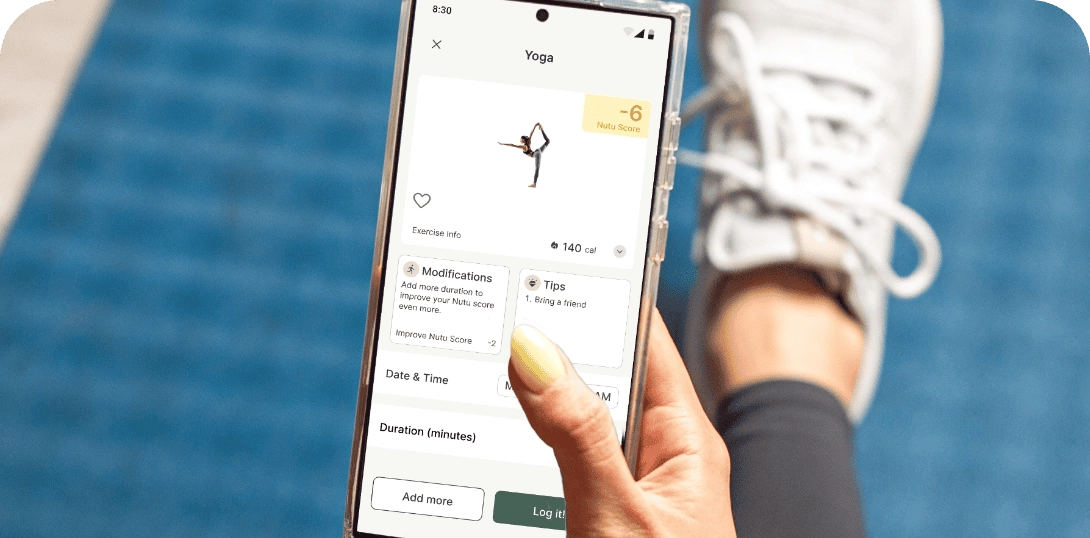
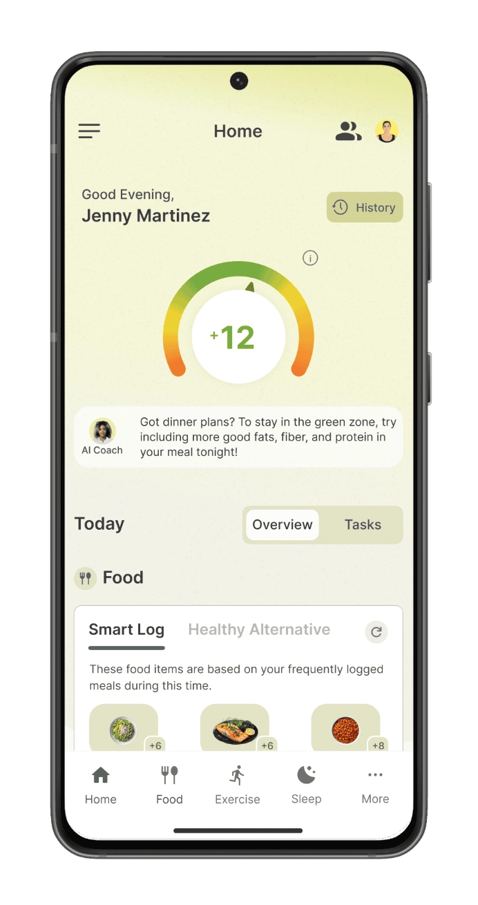
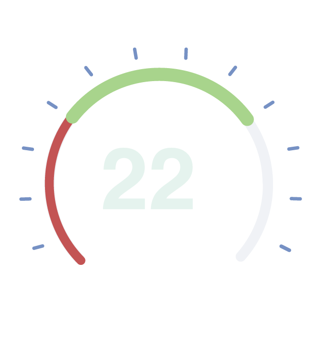
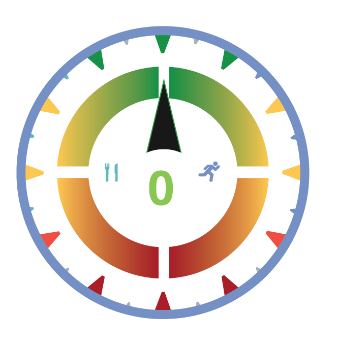
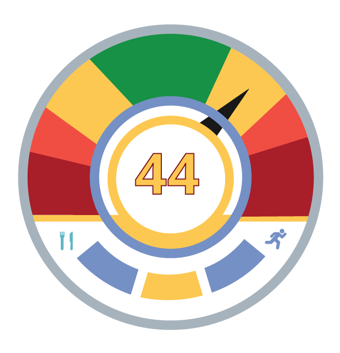
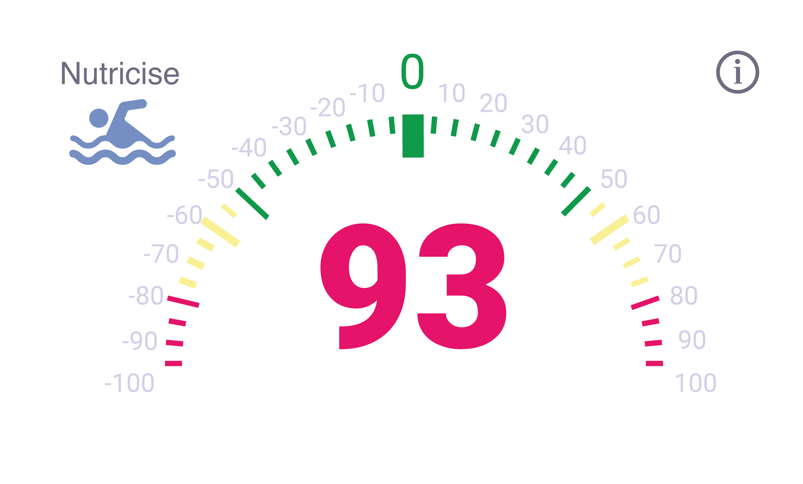
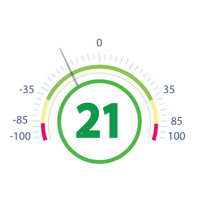
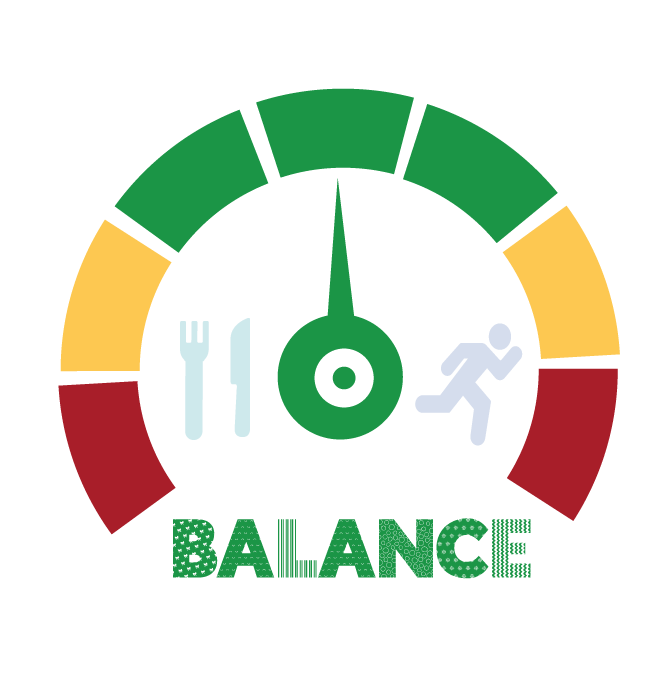
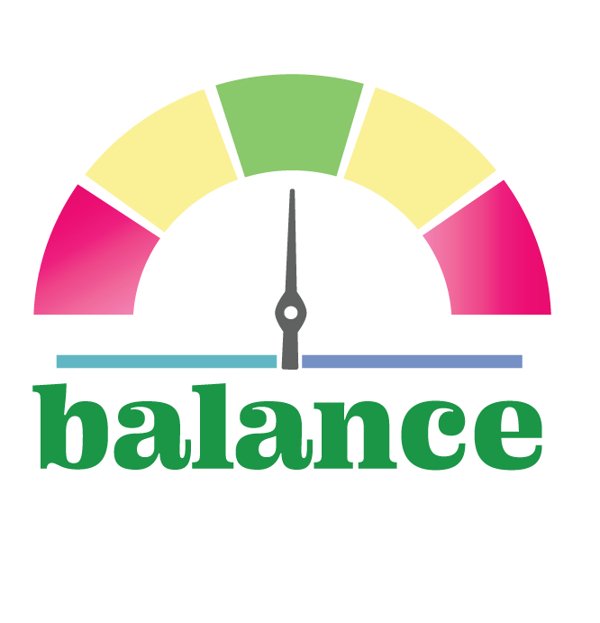
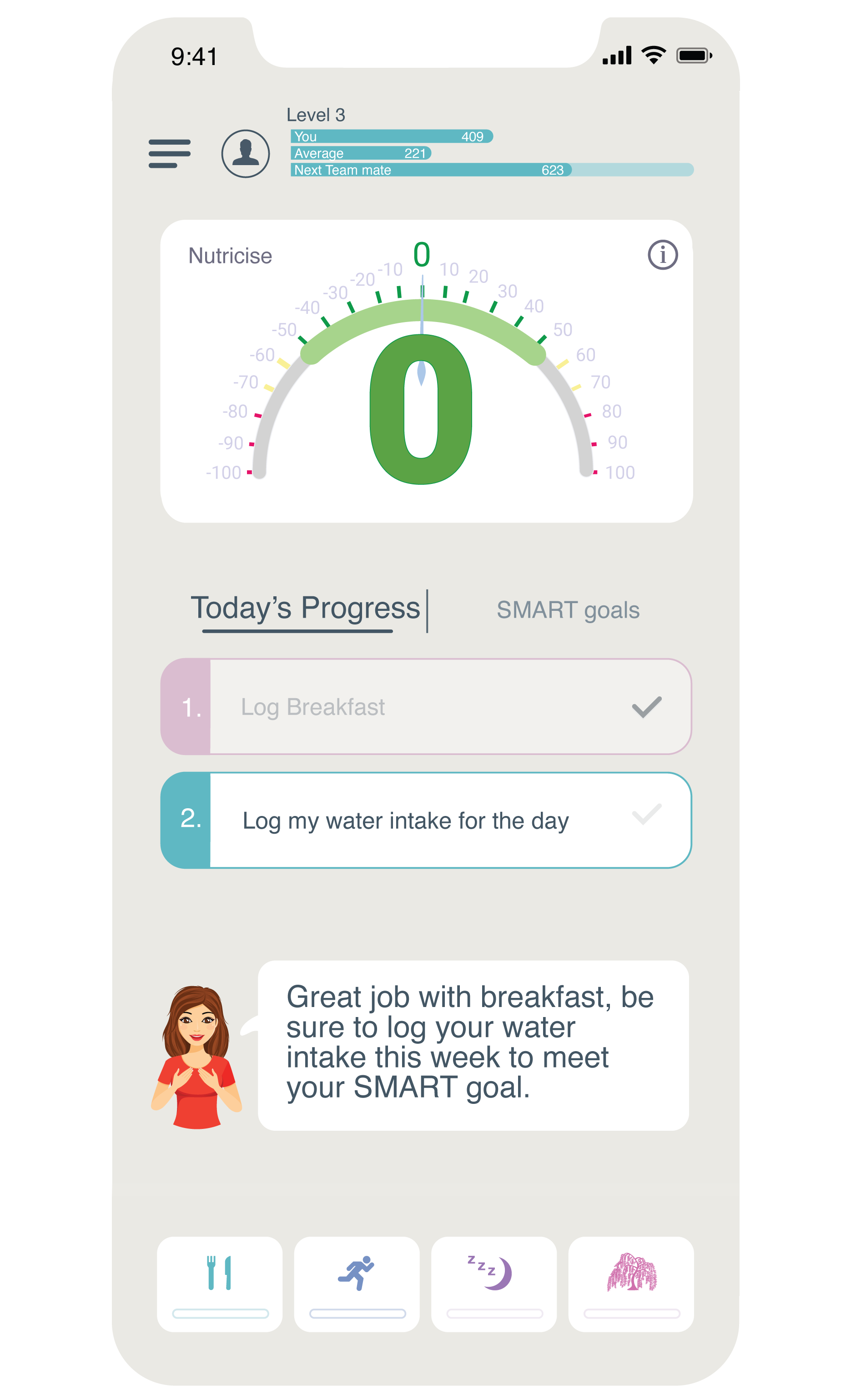
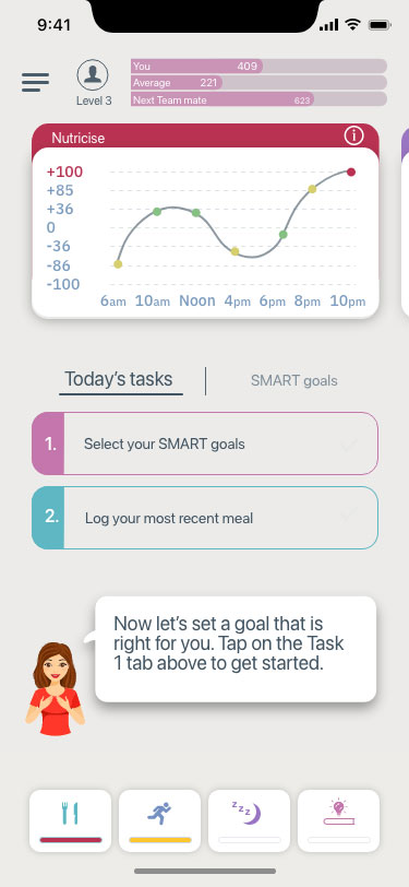
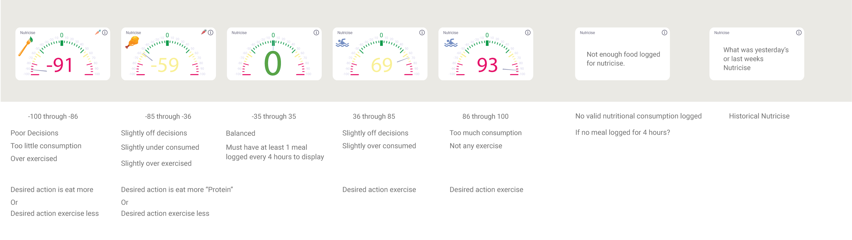
The score and how it works and why it determines a green, yellow, or red status is the core concept to design backed by data and science. Designing for ways to maintaining a healthy lifestyle include psychological safety and accessibility.
To help users at risk of pre-diabetes lose 5–7% of their body weight and establish lifelong healthy routines using AI-driven insights and CDC-recognized curriculum.
Lead UX Architect and Strategy (Visual Design/UX/UI/FED). I mentored junior designers and delivered presentations weekly to C-suite and Founders. Initially created for Cercacor Laboratories and Masimo Technologies, the app was spun off to Willow Laboratories. My ideation designs and iterations lead to the creation of Willow and its branding.
Nutu is a digital health platform designed to prevent Type 2 diabetes and promote healthy living.
Unlike traditional apps that focus on restrictive dieting, Nutu uses an evidence-based Green Zone approach to build sustainable habits.
How do you design an app that is clinical and critical to every aspect of your lifestyle and health? Tracking details and data to share with your doctor and an AI Agent that works with you in real time to keep you balanced throughout the day.
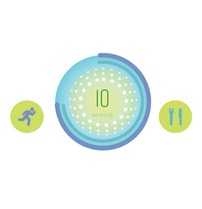
The challege was to work through the Information Architecture, conceptualize how to keep and maintain balance daily to optimize and improve health and track for medical concerns, conceptualize the balance and green zone to quickly monitor health with nutricise points, create a visual design based on nature offering a distinct style.
Users often quit after a "cheat meal" because they feel they've ruined their daily data.
Manually searching for every ingredient in a meal is the #1 reason for churn.
Users wanted to know "Am I doing okay?" without looking at 20 different charts.
Derived from the Latin Nutus (a nod or nudge), the app was built on the philosophy of Small Changes = Big Impact.
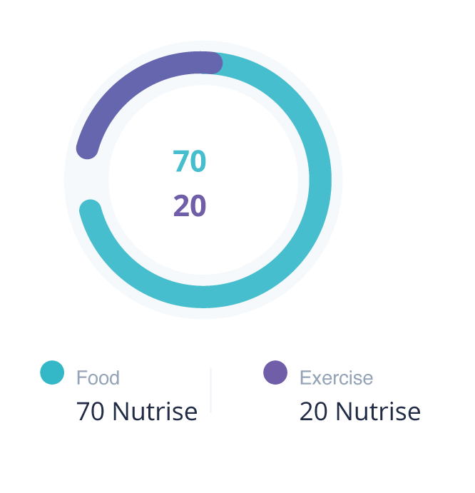
Instead of calories, we developed a proprietary algorithm that integrates:
To reduce friction, we implemented:
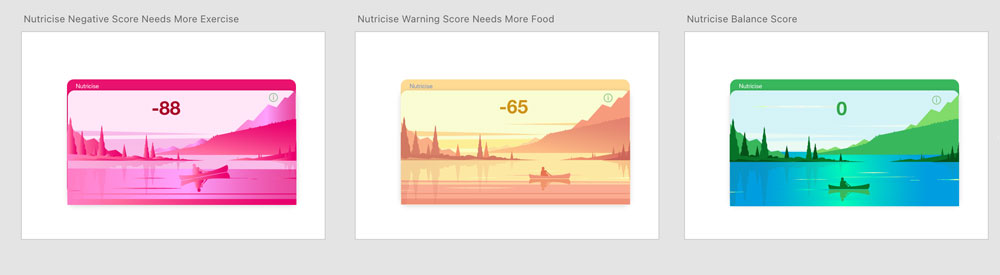
Visual Language and Palette: Calming greens, soft teals, and energetic oranges and softer colors found directly in nature. Avoided "medical red" to reduce user anxiety.
In system settings in some operating systems, a user can set the background and themes to respond to the time of day. This was a concept I explored to help with the accountability linked to meeting fitness and health goals. Knowing the app and score will reset just by a screen color change in the background quietly nudges the user with some psychological safety.
Note: the main screens and landing screens have a unified clean design. The idea being pushed here is for additional methods and content used to bring balance to the whole health of the individual. In these sections of the app, preferences and themes can be set based on a variety of data points, including location.
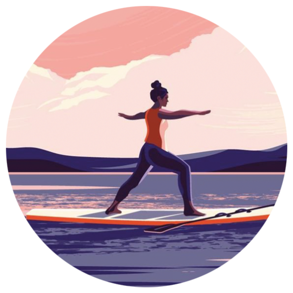
Using the AI within the app, the data can change from sea to mountains automatically and suggest activities, meals, and more based on preferences set in the app. If you like to SUP and don't like to golf, it will suggest SUP spots as a priority over a local golf course.

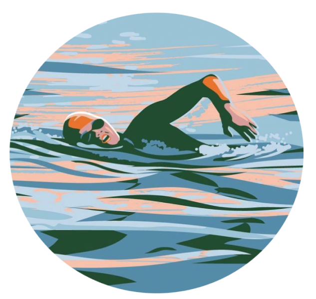
I used my skills in vector drawing and color to quickly create relevant background screens for users to select to customize and theme their app to further add to the personalization and goals of nudging towards better habits and being more active.


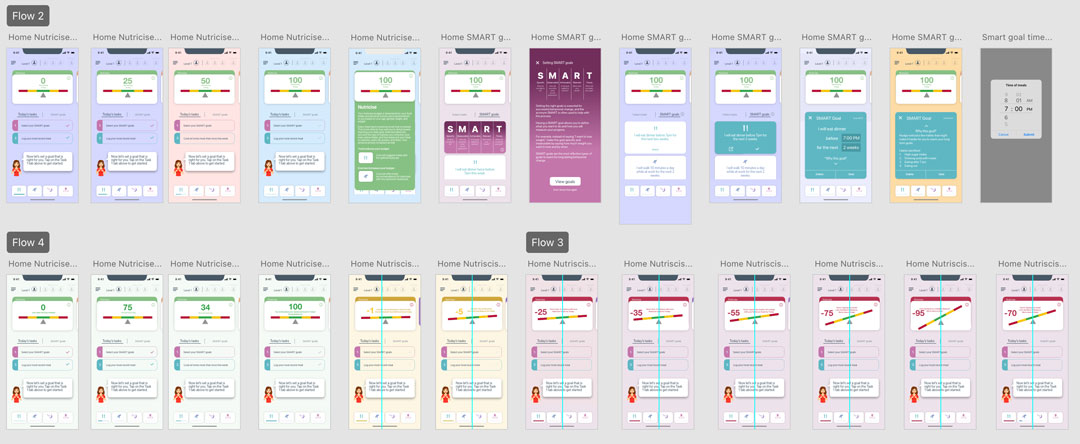
Initial designs had a card theme to showcase the scoring system. The goal is to stay in the green zone. Early iterations of the green zone used various scales with both positive and negative numbers to show the point system and the user's progress.
A negative number is not necessarily a bad score and can reflect healthy habits. Showing the complexity of the score as the algorithm was being formulated caused for numbers in the design iterations to lose their symbolic meaning as working with the CDC, doctors, and research medical staff and Product Owners vetted the science.


If you're looking to connect, let's grab a coffee and chat!
Here's some of what I'm listening to →
test