There is no doubt about it, CSS has come a long way since the early days of the web. CSS has evolved into a sophisticated language with a logic all it's own. Not only does CSS make the web look better, but it makes the web function better too. Good CSS supports interactivity. Additionally, CSS is a light weight solution. it doesn't require the CPU firepower that Javascript needs to run well.
CSS has matured as a language. It now supports a widening range of effects that can fire based on demand. As you design your web pages you should be thinking about the best language or languages to use for particular effects. There are many effects that have been done with Javascript in the past that you will want to do in CSS now. Roll overs are a good example. Originally, all roll overs were created exclusively with Javascript. But using the hover pseudo class and good graphics you can create a light weight CSS solution.
In this module we're going to take a look at some advanced CSS techniques. We'll take a look at CSS transitions, gradients and create a CSS only drop menu.
As CSS matures we are beginning see a small but growing overlap in its capabilities with Javascript. Roll overs, simple animated transitions and transformations that used to be done exclusively with Javascript are now possible in CSS.
For these simple effects, CSS offers many advantages over Javascript.
With all this going for it, CSS should be your first choice when you are looking to pump up the eye candy on a page. Save the Javascript for when you need more complex logic. Javascript is like the elephant gun. It's powerful. It should be reserved for when you need more robust functionality.
There have been many advances in CSS. In this module we are going to use CSS to build a page with animated hovers and a navigation bar featuring a drop menu. To give our page some context we are going to use the CSS we wrote in Module 6 as our starting point.
Duplicate your demonstration folder for Module 6. Make sure there is a copy of template.html in your folder. The only images you will need from the Module 6 demonstrations are the background image and the logo.
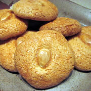
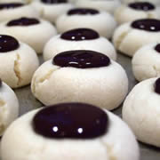
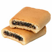
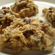
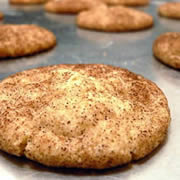
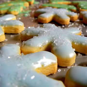
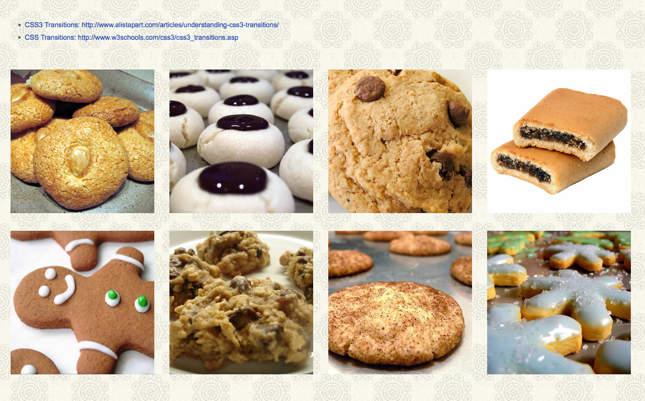
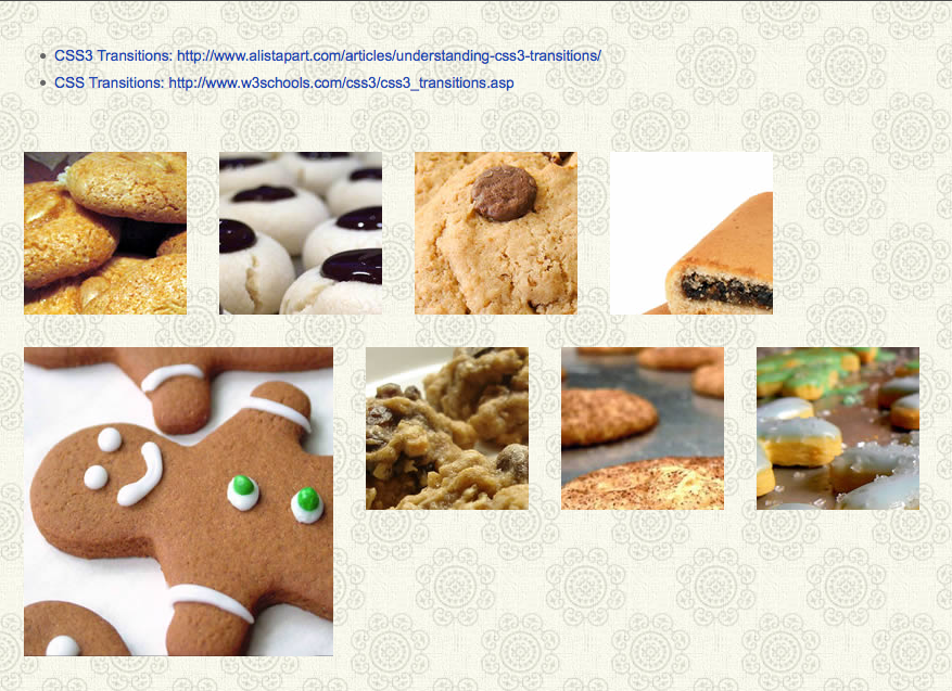
To complete this module you will need six to ten images. Make sure these images are sized so that three will fit across the container. The demonstration file uses images that are 285 x 285px square. The demonstration images are all of cookies. (Okay -- time for us to come clean. When we built the demonstration files we were all on a diet.)
Here are the images we will be using in the demonstration -- they've been reduced to fit on this page:
 |
 |
 |
 |
 |
 |
 |
 |
Before we get into the heavy lifting, we're going to take a look at gradients and transition separately. First we'll take a look at CSS gradients.
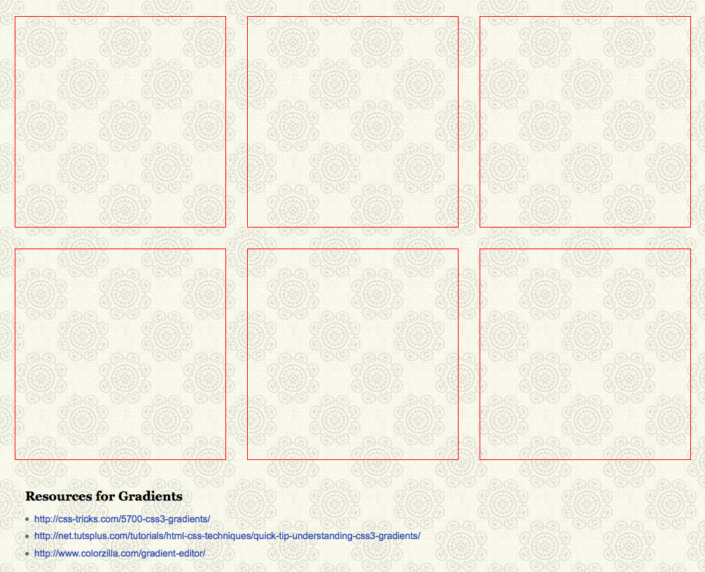
To get an understanding of how gradients work in CSS we're going to build a page with six boxes. Each box will have a different gradient fill. Gradient fills are complex to both understand and write so we'll include some resources at the bottom our page for further research.
Duplicate template.html. Name the new file "m9_gradients.html" Since the page is linked to basic.css that we wrote in Module 6, your page will have a background image fill. That's fine for these experimental pages. In fact, the tiled background will help you visualize how the CSS is drawn in the browser.
Add six divs to the body. Give each div a unique id, "box1", "box2", "box3", etc. Give each div a class called "box".
Add a style tag to the head. Define the box class with a width, height, margin and border. Float the boxes to the left.
Here is the code so far:

Add a div for the resources below the boxes. Give the div a class named "text". Inside the div you list additional tutorials on gradients. Here are three we found particularly useful:
The last one, the gradient-editor, is particularly useful. As you will see hand writing gradients is a pain. The editor is a big help!
Add a style for the text class. Use it to clear the floats and give the text a bit of margin. Here is the amended code:

SAVE! Open your page in a browser. It should look something like this:
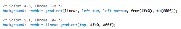
The gradient property is relatively new to CSS3. Most modern browsers support it just fine, but you do need to include vendor prefixes. And of course, just because nothing in web development is straight forward, you will need to use a separate and more complex syntax for earlier versions of Safari and Chrome.
The older Webkit browsers require you to state the gradient type, what corner to start the gradient in, where to finish, what color to start with and what color to end with. This means you can have your linear gradients run on an angle which is not possible in any of the other browsers.
In the interest of simplifying the syntax and harmonizing with the other browsers, the newer versions of Safari and Chrome use the same syntax adopted by everyone else. There are separate properties for linear and radial gradients. This simplifies the syntax. You state the starting point for the gradient, the starting color and the finishing color. Here is what the syntax for the Webkit browsers looks like:
Whenever you use a gradient fill, you should always include a default background. This could be a solid color like we are going to use here, or it could be an image of a gradient. Earlier versions of IE and Opera aren't going to be able to understand gradients and you will need to provide a fall back.
IE10, Opera 11.10 or better and Firefox 3.6 or better all understand the simpler syntax. You probably don't have to worry about earlier versions of Firefox. Firefox updates regularly and the updates are almost automatic.
Here is the completed gradient for box1:

This code produces a gradient that runs from the top to the bottom of the box.

We can flip the gradient by changing its origin point from the top to the bottom. Duplicate the gradient for box1 and assign it to box2. Change the origin point to the bottom of the box like this:
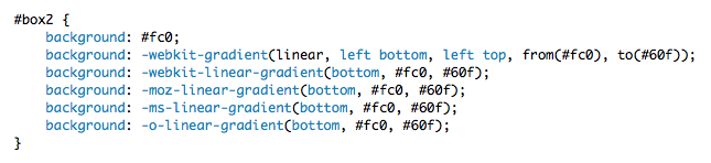
This code results in a gradient like this:
Like wise we can run the gradient right to left or left to right. Duplicate the gradient for box1 and assign it to box3. Change the origin point to the bottom of the box like this:
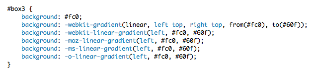
This code results in a gradient like this:
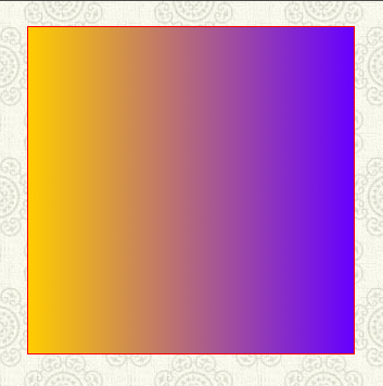
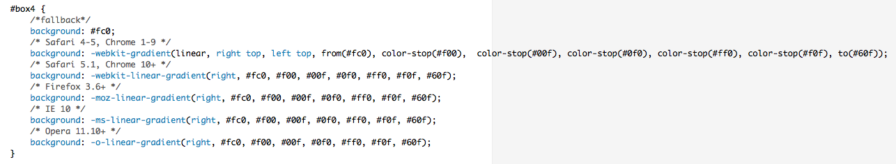
Additionally you can make complex gradients with multiple colors by adding color stops. Again the earlier versions of Safari and Chrome use a more complex syntax. The color stops are explicitly stated like this:

The newer syntax is simple. All you need to do is provide a list of colors like this:

The completed style reads like this:
And produces a rainbow of color running left to right:
Radial gradients are similar to linear gradients. The newer browsers all use a separate property to define linear and radial gradients. With the older version you state the gradient type in the definition. With the newer browsers you use the radial-gradient property (with the vendor prefix), state the origin, the start color, the end color and you're done. here is what the syntax looks like.
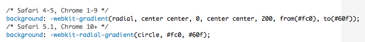
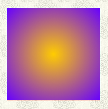
Copy the style for box1 and assign it to box5. Alter the code to create a radial gradient like this:
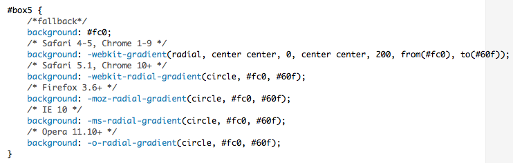
here si how the code renders:
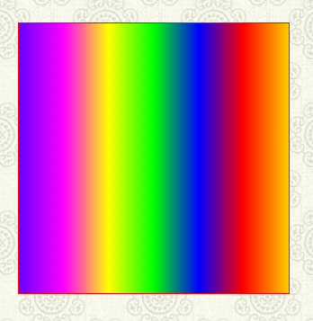
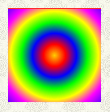
Radial gradients can also take multiple color stops. Copy the style you wrote for box4 and assign it to box6. Convert it to a radial gradient like this:

The above style produces an eye bending, radial gradient:
SAVE! Open you page in a browser and enjoy the light show!

CSS transitions are nothing short of amazing. They add an element of animation to web pages at the formatting level. CSS transitions are a wonderful tool for enhancing the usability of a page. They can help the user understand what to focus on as an animated transition pulls the eye to emphasize a process and softens a jarring change of state.
The CSS3 transitions module has a lot of great properties. As yet, however, it is inconsistently supported by modern browsers. It does represent a powerful enhancement for users who have browsers that support it, so you should feel free to use it -- just be careful and smart about how you use it. No version of IE below IE10 support it.
The transition property is always applied to the starting style of an element. This is the beginning state. The transition occurs when an event triggers a change in the page -- for instance, a hover event -- and the new style is transitioned to. Most properties are fair game for transitions.
The flow works like this:
The shorthand declaration for the transition property has the following form:
transition: property, duration, timing-function;
Property refers to which CSS properties you want to transition. You can set the declarations individually, or use the "all" keyword to transition any and all changes.
Duration is the amount of time, in seconds, that the transition should take.
Timing-function is the desired easing function. They are a fascinating animation concept -- the timing functions in CSS3 are based on a cubic bezier curve. A discussion of easing functions is beyond the scope of this module, but for now, it is enough to to know that CSS3 supports a number of them. They are: ease, ease-in, ease-out, ease-in-out, linear, and cubic-bezier.
The following transition changes all properties over a half-second duration using the ease-in-out timing function:
transition: all 0.5s ease-in-out;
Duplicate template.html. Name the new file "m9_transitions.html".
Like the gradient property, CSS transitions are a complex topic. Here are two articles you may find helpful in understanding their power. The article from A List Apart is particularly good:
As we did with the gradient examples you can include these links on your page in a div with the class "text". Open a style tag and make a simple style for your links.
To get a feel for how transitions work, we're going to drop the images you were asked to prepare at the beginning of this module onto our page. The images will be wrapped in figure tags. The figure tags will sized smaller than our images effectively clipping the image. On hover the figure tag will resize the reveal the entire image. The transition will animate over the course of half a second.
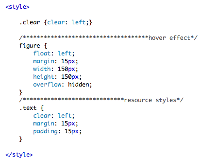
Add your images to your page. Wrap each image in a figure tag. Add a style for the figure tags. Float them left and give them some margin.
If you want to force the figure tags into two rows, you can add a class to the image where you want the break name the class "clear". Define a style for clear that clears the left float.
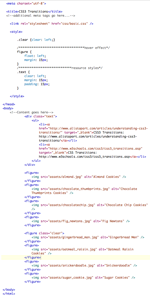
So far our code looks like this:
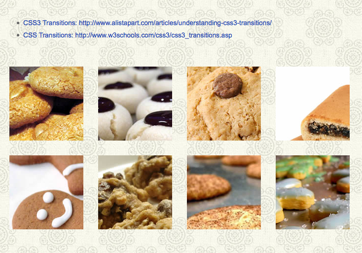
Our code produces a page that looks like this:
We are going to transition the width and height properties. Accordingly, we add width and height properties that are smaller than our images. The demonstration uses images that are 285 x 285px. We set the width and height of the figure tag to be 150 x 150px. Additionally, we set the overflow property to hidden. This clips the image creating a visual crop. here is the code:
And here is the result. Only the upper left 150 pixels are visible.
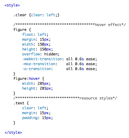
Now we can add the transition property to the figure style using the vendor prefixes. Again, the foot print for this property looks like this:
transition: property, duration, timing-function;
Once the transition is in place we define the style that figure will transition to. In this case we are going to use the hover pseudo class on the figure tag to fire the transition. Be aware that IE won't be able to read hover on the figure tag. IE only reads hover on a tags, but we don't care in this case since it can't read the transition property to begin with!
We write a hover style for the figure tag adjusting the width and height. Our example takes .6 seconds to animate, just over half a second. Here is the completed code:
SAVE! Open you page in a browser. When you hover over the figure tag, the tag expands to reveal the rest of the image. Notice that the hove also displaces all the following figure tags. This is the normal and expected behavior. All the figure tags are relatively positioned.
Now we are going to explore pure CSS drop menus. We are going to look at the powerful "son of suckerfish" technique. The son of suckerfish technique is based on the older suckerfish menu technique. The suckerfish technique is powerful conceptually. If you understand it how it works well you can use it in a wide variety of ways to build original and exciting pages.
The suckerfish technique is one of those rare creatures on the we: a technique that has withstood the test of time. It was first introduced back in 2003 in an article published on A List Apart. It has since been improved upon but the core of the technique remains the same. It works in almost all modern browsers.
The technique relies on the use of the hover pseudo class applied to an li tag. Earlier version of IE only supported the hover pseudo class on the a tag. If you are in the extremely unfortunate position of having to support IE6, there are simple Javascript solutions to force that creaky, old war horse of a browser to comply. You will find it and more in the follow articles about the original suckerfish and the son of suckerfish techniques:
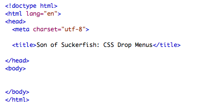
To get a feel for how this works, let's start with a clean, unadorned HTML page. In your text editor, Notepad ++ or TextWrangler, start a brand new file and save it as "m9_suckerfish.html" in your m9 folder.
State the doctype, add the HTML tag, the head and body tags along with the meta and title tags. Your page should look something like this:
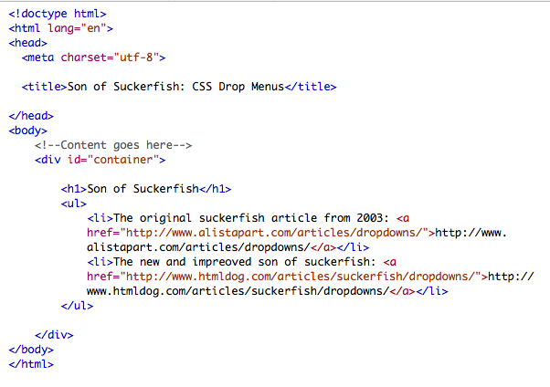
Add a div to the body tag and give the div the id of "container". Add a title using an h1 tag, if you like you can include the article links to the suckerfish technique articles.
The concept behind the technique is this:
First the markup.
The core of this technique are nested lists, you could use this idea on just about any tag that could legitimately hold a nested block level tag. For the demonstration model we used five categories:
(Remember we were dieting ... )
These categories make up a navigation bar. It makes sense to wrap the entire bar in a nav tag.
Each category has a list of recipes. This technique depends on the hover the pseudo class, there is nothing to stop us from linking all the li tags to individual pages. For the purposes of this demonstration, we'll use the hatch mark ("#") as a place holder for the required href attribute.
The nested unordered list is wrapped inside the parent li tag. Below is the first category, the cooky category, with it's child list in place:

Here are all five categories, complete with their child lists:
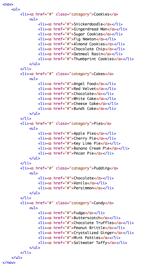
And here is the completed HTML markup:

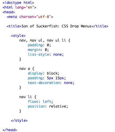
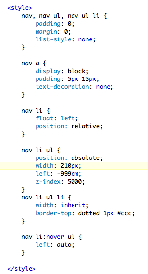
Inside the head tag, add a style tag. First we do a basic reset to remove the default margins and padding on the nav, the ul and the li tags. While we're at it we can remove the list style.
We convert the a tags into block level tags, set their padding and remove the default underline.
Then we can grab the li tags and float them left and set the position property to relative.
Here is the style tag so far:
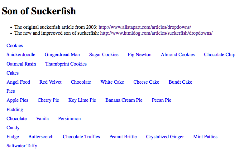
SAVE! Open your page in a browser.
Here's how it looks so far. Not pretty. As you can see, our styles are reading perfectly, all the list items are floating left. But visually, it's a confused mess. Next we'll hide the nested lists, that will go a long way to cleaning up the mess.
Here's how it looks so far. Not pretty. As you can see, our styles are reading perfectly, all the list items are floating left. But visually, it's a confused mess. Next we'll hide the nested lists, that will go a long way to cleaning up the mess.
We add a style that targets only the nested ul tags. We set the position property to absolute. Then we set the left property to a ridiculously large negative number. Here we have used -999em. You could set it in pixels too, it won't matter. The important thing is to hide the menus off to the left of the browser's edge. Finally we give the nested ul tag a huge (5000!) z-index. This insures that when the list is brought into the browser window it is on top of any content on the page.
Here is the style so far.

SAVE! Now our page looks a lot better. The navigation bar looks like a navigation bar.

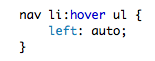
Now to make it work. We need to attach the hover pseudo class to the parent li tag. Then we reset the left property of the nested ul tag to auto. This forces the nested ul tag to inherit it's left position from the parent li tag. For this we need a bit of CSS magic.
And here's the magic bit:
The completed CSS reads like this:

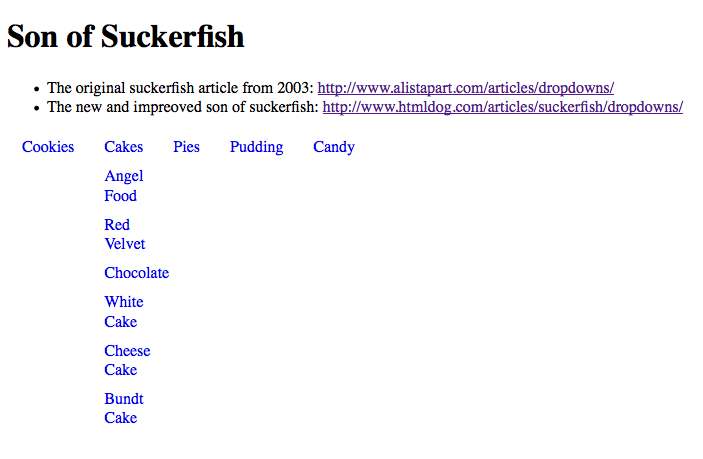
SAVE! Open your page in a browser. When you roll over the parent list item, the nested list pops into place. The child list inherits it's width from the parent li tag. The child list looks scrunched, but the drop menu function is working perfectly.
Styling the child menus is fairly easy to do. We can set the width for the nested ul tag. Then we can style the li tags in the nested list by telling them to inherit the width. We can add borders, fills, whatever we need to make our menu look better.
Here is the completed CSS for a CSS only drop menu:
SAVE! Open you page in a browser. The results are worth it. Here we have a perfectly functioning, readable drop menu with the minimum of code.

Next we are going to return to our recipe site from Module 6. We are going to enhance the navigation. In Module 6 we made a simple horizontal navigation bar using an unordered list and the fancy CSS3 content property. It sat in the upper right. For this module we will pull it down under the logo and turn it into a drop down menu. Then we will style it using gradients to be a true horizontal navigation bar.
Our page content will be our images. They will float in even columns and rows. When the user hovers over an image, the caption will fade into view on a transparent background over the image.
As we did in Module 6, duplicate template.html. Rename the new file "m9_example.html".
in the head of the document add a script tag to pull in the script to force IE to recognize the new HTML5 tags.
Link to both the reset.css and the basis.css files.
In the body, add a div with the id "container".
Inside container, ad a header tag, a div with the id "content" and a footer tag. Add dummy text to footer.
Inside the header tag, add an img tag to pull in the logo. below that add an hgroup tag. To the hgroup tag add the site name in the h1 and the tag line in an h2.
You code should read something like this:

SAVE! Open your page in a browser. It should look something like this:

Add all your images to the content tag. Wrap each image in a figure tag.
Within each figure tag, nest a figcation tag and add the image's caption.
Your code should something like this:

SAVE! Open your page in a browser. The images should stack on top of each other with the captions looking unsightly, something like this:

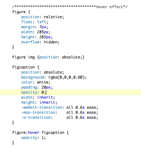
Add a style tag to the head of your document. We are going to use CSS transitions to make a handsome hover effect. The caption will not be visible to the user at first. When they hover the mouse over the image, a transparent background will fill the image and the caption will appear and be readable. When the user mouses out, the fill and caption disappear.
Since our CSS for this demonstration will get a bit long and complex, we can mark the code using comments.
Our strategy is simple. Use the figure tag to define a box that fits the image only. Hide the over flow. Set the position property to relative. Float the images left with a bit of margin to create a grid.
Here is the style that does all that:

SAVE! Open you page in a browser. Notice that the captions have disappeared. You should have something like this:

We can now position both the img and the figcation tags absolutely within the relative figure tag. That will stack the figcation over the img tag.
We can then style the figcaption tag. We give it a 60% alpha black fill using the rgba() property. Set the text color to white. Add a bit of padding.
We can now give the entire figcaption an opacity of 0. Tell it to inherit the width and height from figure.
Finally, add the transition properties as we did in m9_transitions.html.
The property we transitioning is the opacity property. We can add the hover pseudo class to figure and reset figcaption's opacity to 1, or 100%.
Here is the completed style so far:
SAVE! Open your page in a browser. The result looks great. Below you see the effect of a hover over the Fig Newtons.

Grab the entire nav tag with it's nested unordered lists from m9_suckerfish.html. Paste it into the head tag below the hgroup tag. We are going to want to add a type treatment to the category titles. It makes sense to add a class to the a tags wrapping the category names. The mark up reads like this:

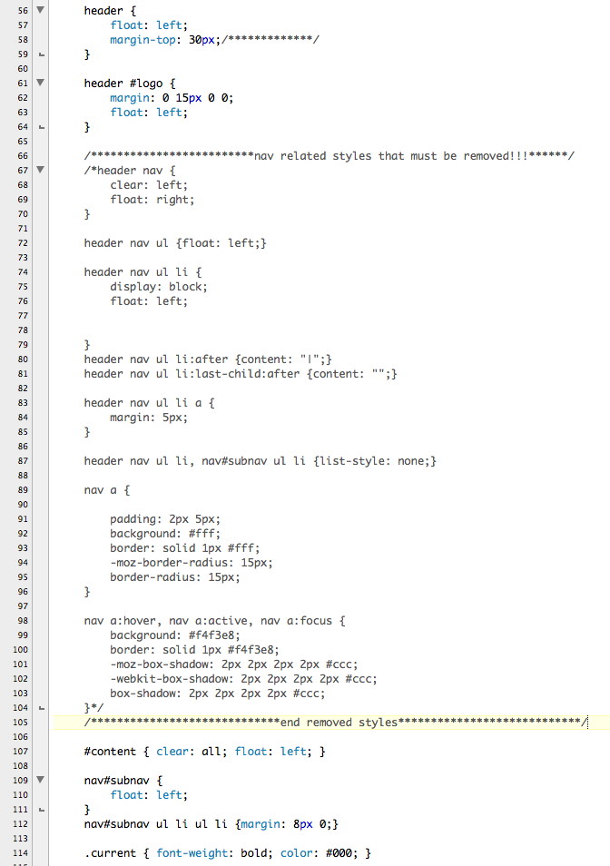
Our page links to the basic.css file we wrote in Module 6. In basic.css we handled the navigation very differently than the way we are going to do it here. You will need to edit basic.css.
Open basic.css in your text editor. Either comment out or remove completely all styles related to the nav tag in the header. For the demonstration, we chose to comment the styles out. below is a screen shot:
Return to m9_example.html.
You can copy all the suckerfish styles from m9_suckerfish.html and past them into your style tag.
Additionally, it's time to make the nav tag look like a real navigation bar.
The logo image is floated left. To force the nav bar under the logo, set the nav tag to clear left. Tell the nav tag to inherit it's width from the header tag. Add a border.
Additionally, all ll the list items in our navigation will be floated left. To contain the floated items we can float the nav tag left.
Add a bit of margin to the top so that it sits nicely under the logo and hgroup. Adding a border-radius makes the navigation look more like a contained bar.
Now we have a dilemma. We need to add a left margin to our top level list of categories. If we were to say:
header nav ul { margin-left: 30px; }
Then all the ul tags, including the nested child lists, would inherit the margin. We only want the top list of categories to move left. The list of parent list is the first child of the nav tag. We can use the first-child pseudo class to target it and it alone like this:
header nav ul:first-child { margin-left: 30px; }
Our styles for the nav bar, complete with the suckerfish styles so far read like this:

SAVE! Open you page in a browser. Our page is looking pretty good now. With a bit more work on the navigation bar and drop menus, it will look great.

First we'll add a gradient to the nav tag. To be perfectly honest, when we were developing the demonstration files for this module, we found writing the gradient code so annoying and error prone that we just went to our favorite gradient generator and copied and pasted the code it wrote for us! Feel free to do the same. We used:
Once the gradient is pasted into place the nav style reads like this:

We use the category class to define a nice type treatment for the category titles:

SAVE! Open you page in a browser. Now our page is looking pretty good!

Additionally it would be nice to add a more elegant hover style for the drop menus. The highlighted styles below do just that.

SAVE! Open you page in a browser. Our page is complete.

Please complete the following demonstration files detailed in this module using your own graphics.
Validate your code. Make the necessary corrections. Upload your pages to your web server space and post the URLs in the Class Discussion.
The purpose of this assignment is to gain more experience with advanced CSS concepts and techniques.
This assignment is due by the end of Module 9.
Place all of your files in a folder, and name the folder m9_yourlastname. Upload your folder to your server space. ZIP the local copy of your folder. Post the URL to the appropriate topic in the Class Discussion, and attach the ZIP of the folder.
Use the following file-naming convention:
- m9_yourlastname.zip
Description
For this project you will be building a portfolio of your work. The portfolio will serve as a vehicle for you to display your work as you progress through your degree program. You are building a website for yourself to display your growing skills. This portfolio will evolve over the course of your education. As you take more courses you will have more work to show.
This is a professional portfolio, and as such it is a more targeted site. You should select and carefully edit the work you want to show. This portfolio is a demonstration of your professional skills and judgment.
Your target audience includes your department director, instructors, classmates, and eventually, future employers. You will use this site as part of your mid-point review presentation. The committee will want to know more about you. They will need to see demonstration of your technical skills as well as your design skills. As you think about this portfolio, consider how you want to be perceived and design accordingly.
Your portfolio should include the following sections:
Final content and page list will vary somewhat from student to student -- the important thing is that the final piece fairly represents you.
A further consideration is that your portfolio is a "living" document. It is not a static brochure, but rather a growing, evolving site. As you think through the navigation, keep in mind that you will be updating this site in the future to include a growing body of work.
Each page must include:
If you already have a portfolio that you like and fits you well, you can propose to create another site, but you will need to show your site and get approval. Everyone in this program is required to have a web-based portfolio.
See DUE DATES section below for breakdown of individual module assignments.
Technical Requirement
This is a web-based portfolio. You should design using web "friendly" technologies. The site should be developed in HTML with external CSS and JavaScript. You may use Flash to enhance your site with animation and interactivity. This is an HTML class -- you may not build a Flash site. You may include sound files, video, animation, and anything else you feel will show your work off in its best light.
Purpose
Tools
Due Dates
Due Module 8: Define, Describe & Gather -- Begin collecting your content. Make a list of all the work you would like to show. Begin writing your resume, if you don't already have one. Write one paragraph that describes you as an artist. Write a second paragraph about what you would like your portfolio to do for you -- what would you like people to understand about you from viewing your portfolio?
Due Module 9: Finish collecting content and begin designing -- Continue to collect and refine your content. Make a list of all the different kinds of media your portfolio will need to accommodate. Begin grouping your content into categories. Start thinking about the hierarchy of your categories. Complete your resume.
Make a list of everything that must be on each page. Using the media of your choice, make your first design pass. You can use paper, pen and pencil or use your computer. Keep your designs flexible. Remember, this is just your first pass. Pick just three pages from your site to design -- don't try to do all of them. Be sure you have included everything that must be on every page.
Due Module 10: Redesign -- Using the feedback you received from your first design, re-work your site design. Pay particularly close attention to the navigation. Pay attention to the value range in your colors. Make sure there is enough contrast in the darks and lights.
Due Module 11: Complete design and begin coding -- Do any needed final tweaks on your design and begin coding. Validate your pages as you go. Separate the CSS out into external sheets and link to your external CSS. If you are going to need any special kind of interactivity, begin planning for it now. If you want to use some JavaScript or JavaScript Libraries, start looking the code you will need.
Due Module 12: Continue coding and begin production work on your content -- Continue making your pages and refining your code. Make any last tweaks to your designs as you code. Make sure all your pages validate.
Due Module 13: Finish coding and complete production work on your content -- Complete coding. Get as much working as you possibly can, even if it is rough.
Due Module 14: Final clean up, editing, submit -- Use this module to clean up any loose ends. This is the time to test your site and fix all the little snags and tidy up the messy bits.
Submission Directions
Put your files in a folder. Name your folder "m8_final_yourlastname". Upload your folder to your server. ZIP the local copy of your folder. Post the URL to the appropriate Class Discussion topic and attached the ZIP of the folder.