Sorting by Shape or Color (continued)
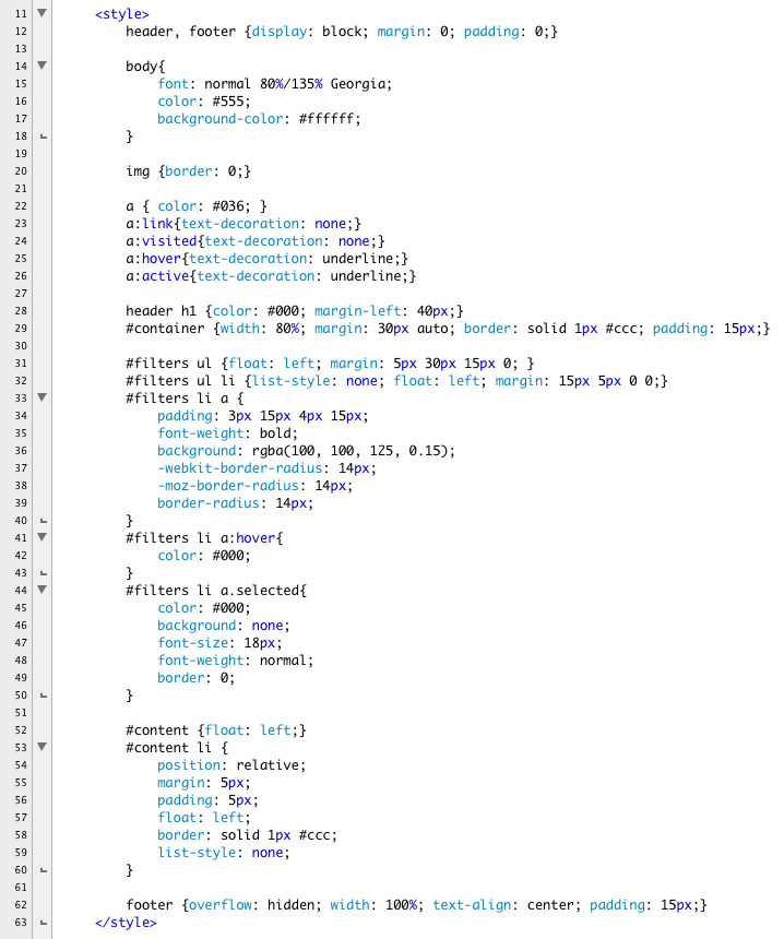
Next we will write the styles. We have two lists that need to be styled. Remove the links to basic.css. It is more than we really need for this exercise. Instead, we will include a handful of basic styles and reset the browser defaults where needed. Remember, header and footer need to be told to display as blocks.
Set the width of container to be a percentage, in this case 80%. This will force the grid to be fluid.
Below are the basic styles that the demonstration file uses:
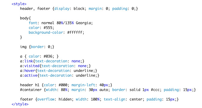 |
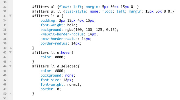
The filters are more interesting. We've sequestered the ul inside the filters div. This makes the CSS a little simpler to control. Since we are going to float all the li elements into a horizontal bar, we can float the parent ul left. This gives us control of the entire bar.
The list items (li) have their list style removed; they are floated left and have a bit of margin. The top margin is relatively tall. This is because grid is fluid, this list will at times wrap, and we want to be sure there is enough top margin to give the buttons clearance.
The nested a tags have transparent backgrounds, thanks to rgba and radial backgrounds. In IE 8 or below, these will look like text links, which is perfectly acceptable.
The a tag gets a contextual hover treatment -- see Line 42 below.
Lastly, we create a class named "selected" to highlight the option chosen. Notice that this class can only be applied to an a tag nested inside a li tag that is a child of filters.
 |
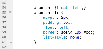
Like the buttons, the images are in an unordered list. The list is nested inside a containing div with the id "content." Since we are creating the grid of images using floats, we can use content to shrink-wrap the grid by adding a float:left to content.
The individual li tags have margins, padding, and borders added. The list-style is removed and they float left.
 |
And finally, the footer receives a little CSS:
Here is the CSS in full:
 |
Save.